That's what my animation class whom I will hopefully be working with to make a small station bump for the MDCTV calls this technique.
This short though was made completely on my own though. Oddly enough it was for my color & comp class though. In which, my prof for that class seems to embrace animation more than other profs I've had (which is awesome). The "limitations" for this was basic shapes. The actual assignment wasn't an animation at all though, but she leaves that door open if we wish to go through.
Assignment: [Using four shapes create compositions where the original form is not known by cutting it and rearranging. Then do the same thing but where the original shape is obvious].
I tried to interpret that into animation using the materials requested and came up with a generic story, and rather drawn out storyboard that produced this:
October 30, 2009
Maya and Art
I'm actually kind of blown away about the amount of stuff I've learned about art from Maya. Maybe learned is not the correct word, affirmed? maybe. Just a couple of weeks prior to this semester, the fact that lighting was important finally started to settle in. Now though, it's obvious (mental ray).
I asked my prof what separates those cheap 3D commercials on TV from a Pixar render and he told me it all really comes down to the textures and the lighting. Maya says:
Which of course, now that I read it, makes sense. In maya you can even tweak about a thousand setting on light that harken to stuff I've seen illustrators talk about like "Rim lighting", "Lambertian reflectance", which blows my mind because I've never really been told about this by anyone, but then I come here and it's all there.
I know in art: "Draw/Paint what you see", but...I like to go better by what Michael Mentler over at Conceptart.org's forums (and I think I've mentioned it here) says:
Anyway, the first house is based on a reference image we imported from an architect student's model at our school. The clouds were actually made in class using the 3d texturing for them from spheres.
The 2nd and 3rd are from our Maya Book, where we just had to model all that stuff and mess with shaders and the uv axis. Our prof also went a bit further and made us put in texture on the chimney.
The last couple were not modeled by us. They came with Maya. We just rendered it from that gray lambert base to a better lit up scene with fancy colors using the mental ray and its caustic settings, global illumination (which ties with photography sooo much), shadows, reflectivity and bunch of other settings I'm still not quite sure how they work. The helmets were modeled by us though, we got the ref image on the planes from Maya though.

2.jpg)


I asked my prof what separates those cheap 3D commercials on TV from a Pixar render and he told me it all really comes down to the textures and the lighting. Maya says:
In the real world, objects are seen in specific ways based on the following:
- The materials they are made of.
- Their surface textures.
- How they are lit and reflect light.
- The environment surrounding them.
Which of course, now that I read it, makes sense. In maya you can even tweak about a thousand setting on light that harken to stuff I've seen illustrators talk about like "Rim lighting", "Lambertian reflectance", which blows my mind because I've never really been told about this by anyone, but then I come here and it's all there.
I know in art: "Draw/Paint what you see", but...I like to go better by what Michael Mentler over at Conceptart.org's forums (and I think I've mentioned it here) says:
"Draw what you know you see not what you think you see"
Anyway, the first house is based on a reference image we imported from an architect student's model at our school. The clouds were actually made in class using the 3d texturing for them from spheres.
The 2nd and 3rd are from our Maya Book, where we just had to model all that stuff and mess with shaders and the uv axis. Our prof also went a bit further and made us put in texture on the chimney.
The last couple were not modeled by us. They came with Maya. We just rendered it from that gray lambert base to a better lit up scene with fancy colors using the mental ray and its caustic settings, global illumination (which ties with photography sooo much), shadows, reflectivity and bunch of other settings I'm still not quite sure how they work. The helmets were modeled by us though, we got the ref image on the planes from Maya though.

2.jpg)


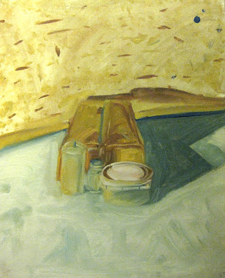
Mo, mo, mo, mo paintings Morandi!
Updated some of the black and white paintings and added another in. We also started working in color! Very exciting, but as any book on painting will tell you: overwhelming.
To try and solve that problem my prof had a colleague come in and do a presentation he had for his own class the night before. It was a brief discussion on Giorgio Morandi and his very limited palette and rather unique approach to painting. This discussion turned out to be far more influential on me than I had ever thought.
In terms of composition, value, saturation, the hues, the approach, and the mindset, Morandi did everything I thought was maybe a little too eccentric. His composition was often smack in the middle with a lot of attention to negative space, his palette was earthy and not "vibrant", most of the brushstrokes were just laid on without too much care (or so I think), yet...the paintings worked.
I'm detailing this because for most of the color paintings the class was limited to Ultramarine Blue, Yellow Ochre, Burnt Sienna, and White. We were also told to try and paint in the style of this Morandi character. It was very different, but oh so great.
Later on we did get to use other colors though, especially for the portrait.


