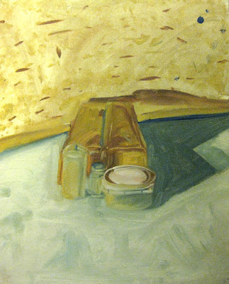
To try and solve that problem my prof had a colleague come in and do a presentation he had for his own class the night before. It was a brief discussion on Giorgio Morandi and his very limited palette and rather unique approach to painting. This discussion turned out to be far more influential on me than I had ever thought.
In terms of composition, value, saturation, the hues, the approach, and the mindset, Morandi did everything I thought was maybe a little too eccentric. His composition was often smack in the middle with a lot of attention to negative space, his palette was earthy and not "vibrant", most of the brushstrokes were just laid on without too much care (or so I think), yet...the paintings worked.
I'm detailing this because for most of the color paintings the class was limited to Ultramarine Blue, Yellow Ochre, Burnt Sienna, and White. We were also told to try and paint in the style of this Morandi character. It was very different, but oh so great.
Later on we did get to use other colors though, especially for the portrait.


No comments:
Post a Comment